Squarespace Review: Great for Some People, but Not for Everyone
Are you interested in using Squarespace as your website builder? If so, take a moment to read this Squarespace review before making any decisions. A website builder or eCommerce builder usually ends up as the primary place you complete design work, process orders, or manage anything from bookings to subscriptions, and marketing to blogging; so you want to pick the right one.
Here’s what we’ll cover in our Squarespace review:
- A general introduction to what Squarespace is and how it works
- A hands-on look at what it’s like to create a website with Squarespace
- Squarespace pricing details
- Thoughts on Squarespace templates
- Squarespace’s support options
- The pros and cons of using Squarespace
- When you should use Squarespace vs a Squarespace alternative
Keep reading to learn all about Squarespace!
What is Squarespace?

Squarespace is a SaaS (software-as-a-service) website builder that sells all-in-one subscriptions for users to design, host, and manage their websites from one dashboard.
Compared to self-hosted builders like WordPress or Magento, Squarespace doesn’t require you to go out and find your own hosting, domain name, or extra plugins to construct the website. Squarespace also handles all of the basic technical details for you, so you never need to worry about securing your site, updating software, taking backups, and so on.
Beyond that, Squarespace’s pricing is fixed, so you always know what you’ll pay each month (which isn’t true of all website builders).
You can create an account on Squarespace just like you register for any other website. Then, you can utilize its wide range of templates to launch a professional design right from the start. You’ll also be able to customize the template using a visual, drag-and-drop builder.
The whole point is to make web design simpler for non-coders, but it also offers options for developers to insert HTML and CSS (though you don’t get full access to your site’s underlying code like you would with an open-source tool such as WordPress).
Finally, Squarespace provides plans to create an eCommerce website with payment processing integrations, product catalogs, and shopping cart modules. It depends on the pricing plan you choose but, in general, the standard website plans are on the lower end of pricing, while eCommerce websites require a higher fee.
Let’s start by taking a look at what it’s like to use Squarespace. Then, we’ll dig into some more specific details and the pros and cons of using Squarespace.
How to get started with Squarespace (and a look into the interface)
In this part of our Squarespace review, we’ll outline the immediate steps you must go through to create a Squarespace account and launch your first website. Throughout that process, we’ll take note of the dashboard, highlighting the advantages and disadvantages of the user interface.
Here’s how it works…
1. Register for a Squarespace account
To begin, go to the Squarespace homepage. Click on one of the Get Started buttons; these allow you to start a free trial without typing in any credit card information. That’s a good start!

The Get Started guide on Squarespace asks you to create an account using an email and a new password. You can then either skip the questionnaire from Squarespace or fill in the details to help the wizard provide you with suitable website themes.
2. Choose a template for your website
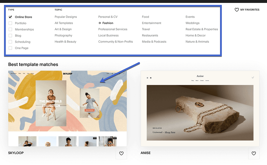
After answering the questions (or skipping them), you’re brought to the template library; Squarespace delivers the most suitable templates based on answers you provided about your potential store. Otherwise, you can use the library filters to narrow down your search to specific template types and topics.
Overall, Squarespace does a wonderful job of organizing and suggesting templates. Not only that, but the designs are free, look more professional than much of the competition, and you can swap them out without any problems.
Some template types and topics include:
- Online store
- Portfolio
- Memberships
- Scheduling
- Photography
- Art and design
- Fashion
- Entertainment
- Media and podcasts
- Nature and animals
- Weddings
You can click to preview themes that look useful for your brand and then select the one you like:
3. Explore the Squarespace dashboard
Much of the Squarespace setup interface strives for automation through questions. By this, we mean that you’re shown popup windows with quick questions. Then, the answers to those questions are used to fill in the content of your website.
For instance, after picking a template, you’re prompted to type in the Site Title, which gets added to your website instead of requiring you to type it into the Settings page yourself.
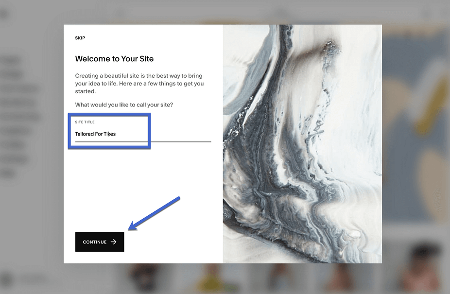
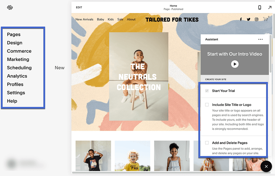
Much like its sleek templates, the Squarespace dashboard provides a stunning design using bold fonts, minimalist navigation, and a constant view of your website’s current design.
To the left, the dashboard has just about every menu item you need to configure your website, including buttons for:
- Pages
- Design
- Commerce
- Marketing
- Scheduling
- Analytics
- Profiles
- Settings
- Help
It’s also not a bad idea to consult the Squarespace Assistant module on the lower right-hand corner. Similar to startup guides you see in Shopify, Wix, and Weebly, the Assistant outlines steps you need to take to make your site fully functional, starting with an option to include your site logo and moving onto settings for adding pages, buying domain names, optimizing for search, and more.
4. Customize your site with the Squarespace editor
It’s possible to click through the main menu to configure those elements, but we suggest going right to the Edit button to open the Squarespace drag-and-drop designer.

Squarespace uses a section-based approach to editing. Essentially, you’ll put together a page’s design by adding multiple pre-built sections, just like you’d build something with Lego blocks. You might have one section for your headline, another for your contact form, and so on.
For each section, you’ll also be able to fully customize the content inside. This doesn’t give you quite as much flexibility as a 100% free-form visual editor, but it does make it a lot easier to create a good-looking design if you’re not an experienced website designer.
Thanks to recent changes to the editor, Squarespace does now also let you add standalone blocks in addition to sections, which does give you a little more control.
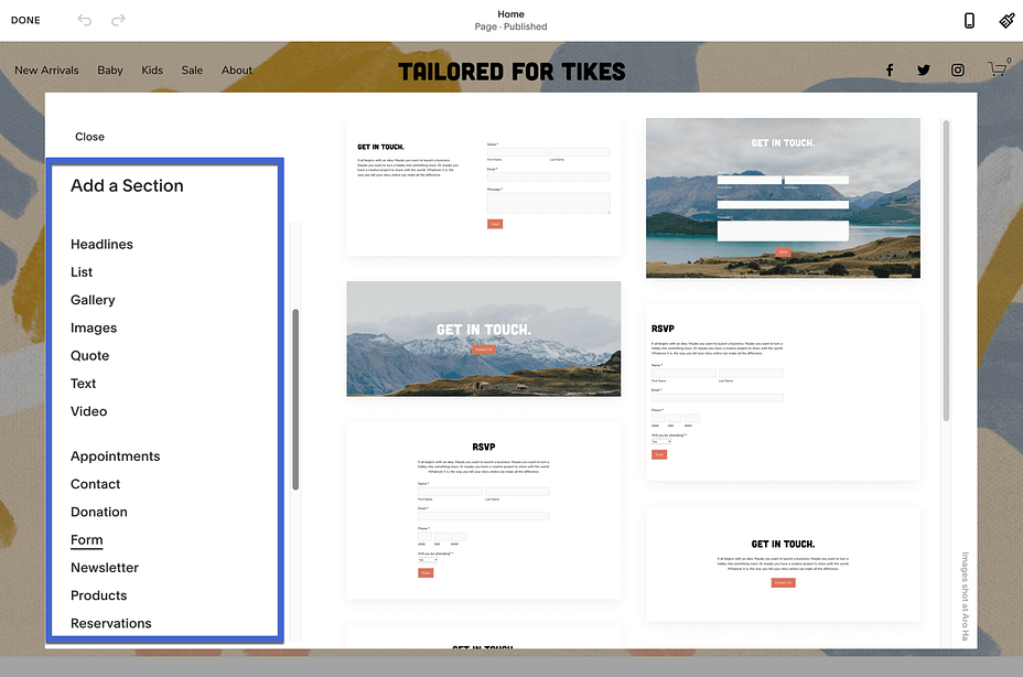
You can scroll over certain elements to edit what’s already there (like adjusting settings for an image, headline, or button) or select one of the Add Section buttons to find and insert other modules not already included in the template.

In the Add Section library, you have a list of standard categories like Headlines, Images, and Textboxes. Scroll down a bit more to find more advanced prebuilt sections, ranging from Contact Forms to Appointment sections, and Product galleries to Reservation boxes.
When you pick one of these, they get placed inside the website design for you to edit their direct settings, move to other locations, or delete if you don’t like the result.
It’s also possible to edit the site header right from the drag-and-drop builder.
We see this as a significant advantage for Squarespace since it’s not all that common to see a header builder inside the drag-and-drop section of a website editor. Even builders on WordPress, or the editor in Shopify, make you go to a separate settings area to adjust the header.
With Squarespace, you simply stay in the same section to insert logos, modify colors, and change the header to a fixed position.
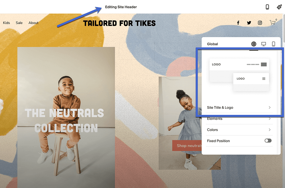
You can also edit on the go with dedicated mobile apps for the editor. This unlocks some cool functionality, like dragging an image from your iPad’s Photos app directly to your website.
5. Configure other settings
As for all other settings, the main menu offers an impressive collection of built-in features; under the Design tab, you can find settings for the browser icon, checkout page, and social sharing, along with a custom CSS panel.
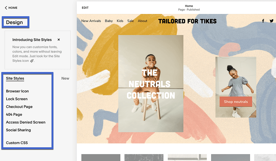
And if you plan on launching an online store, the Commerce section provides everything you need to make sales, with sections for:
- Orders
- Customers
- Discounts
- Print On Demand
- Related Products
- Customer Notifications
- Payments
- Much more
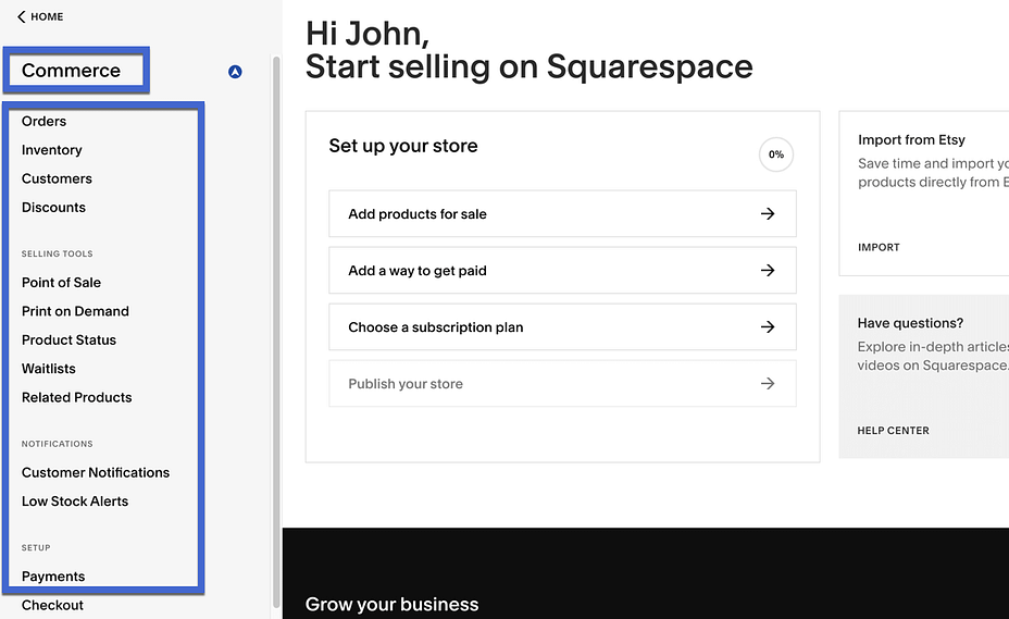
Overall, the Squarespace interface stands out due to its intuitive design, built-in features, and incredible drag-and-drop designer. Compared to other website builders and eCommerce platforms, Squarespace makes it effortless for beginners to build websites, but also makes those sites look intriguing with beautiful fonts, high-resolution images, and prebuilt sections. We also enjoy the quick development tools for inserting your own CSS if needed.
However, if you’re an advanced user who wants truly free-form design, you might prefer a different tool that doesn’t use Squarespace’s section-based editing approach (though Squarespace has improved in this area).
Squarespace review: Pricing
So how much does it cost to sign up for Squarespace? With four flexible, transparent plans, Squarespace allows users to only opt for the features they need, while also keeping costs low and receiving all features built into the system.
Here are the pricing plans:
- Personal: Starting at $12 per month for access to the Squarespace website builder and templates, unlimited storage and bandwidth, basic website metrics, Squarespace extensions, SSL security, SEO features, 2 contributors, limited access to the Squarespace Video Studio app, and 24/7 customer support.
- Business: Starting at $18 per month for everything in the previous plan, unlimited contributors, premium integrations and blocks, CSS and JavaScript customization, advanced analytics, promo banners and popups, and a fully integrated eCommerce store to sell unlimited products, accept donations, and sell gift cards. Transaction fees for this plan are 3%.
- Basic Commerce: Starting at $26 per month for all features in the previous plans, a decrease to 0% transaction fees for your online store, a point of sale, customer accounts, a checkout on your domain, eCommerce analytics, products on Instagram, limited availability labels, and merchandising tools.
- Advanced Commerce: Starting at $40 per month for everything in the previous plans, a 0% transaction fee for online stores, abandoned cart recovery, commerce APIs, advanced discounts, advanced shipping, and subscriptions.
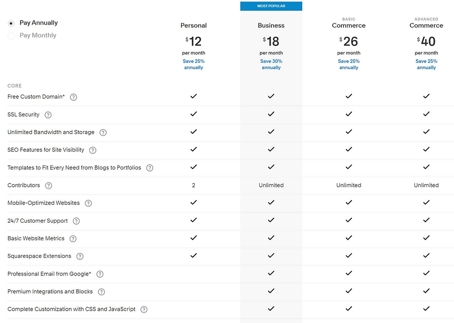
Keep in mind that our Squarespace review of pricing above refers to annual plan commitments. You can also pay on a monthly basis, but the pricing goes up a bit. For instance, the Personal plan is $16 per month, the Business plan is $26 per month, and the Basic Commerce plan is $35 per month when paid monthly.
There are free products and services, like free custom domains and professional email from Google, but those are promotional features that are only free for one year.
If you’re a student or teacher, be sure to check out the Squarespace educational pricing.
Squarespace review: Designs and themes
There’s no doubt Squarespace thrives from its focus on design.
The company always had a penchant for making elegant, artistic templates that beat out what you’d get from most of the competition.
These designs cater to specific website types like online stores, portfolios, and membership sites, while also providing unique layouts for things like professional services, local businesses, and restaurants.
As of this article, the official template library boasts a total of 142 designs, and the development team from Squarespace tends to release new ones on a regular basis.
This number is lower than some other platforms, but you should still be able to find a template that matches your needs. If you can’t, you can also find third-party Squarespace templates, though you’ll typically need to pay for them.
We covered how easy it is to implement a template in the previous section, but we also want to talk about the transition of a template from the library to your website.
Quite a few eCommerce platforms and website builders show you attractive themes in their collection, fitted with the perfect images, fonts, and formats. However, you then publish the theme to your site and much of that “demo” content gets stripped from the template, leaving you to work with more of a framework than a true starter website.
Squarespace takes a different approach; all of that demo content remains. There’s no difference between what you see in the template library, so the website is technically ready to publish. All you have to do is swap out media items, fill in your own text, and upload a logo. That’s the way templates should work, and that’s how Squarespace makes it happen.

Along with powerful font options, a focus on high-resolution imagery, and minimalist formatting, Squarespace templates bring out a sense of creativity in every website, pushing you to share your skills, products, or services in a way that’s not only intriguing but stylish.

Squarespace review: Customer support
In a world of 24/7 customer support, how does Squarespace match up to platforms where users can get in contact with someone at all times? And did our Squarespace review show that the company offers reliable online resources to complete your own research?
Let’s start with the dashboard support resources, seeing as how it’s nice to have answers to your questions where you’re working the most.
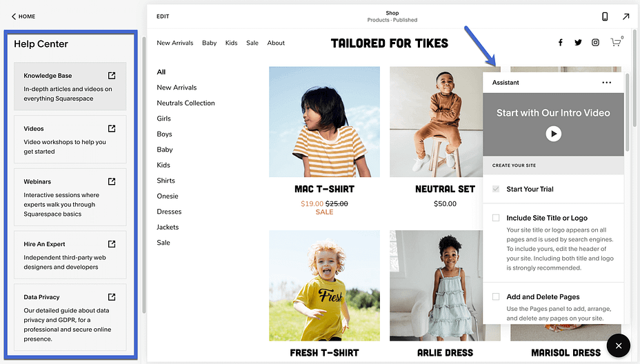
Squarespace offers solid resources in the dashboard, including the Assistant module for viewing videos, walking through the setup of your website, and seeing tips on where to configure certain settings.
In addition, you can go to the Help Center section to get links to the most important online resources like:
- A knowledgebase
- Videos
- Webinars
- The “Hire an expert” page
- Data privacy information
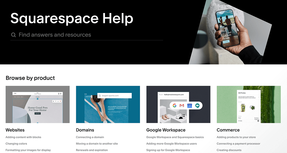
The online Help Center serves as the go-to portal for answering your questions. You can browse by product, locate resources using the search bar, or sift through topics to find articles and videos meant to assist you at any point in your web design journey.
Some topics from the knowledgebase include:
- Learning how to set up an online store
- Registering your domain names
- Spreading the word about your business with Squarespace marketing tools
- Creating content with blocks, sections, and pages
- Adding third-party integrations to expand the functionality of your site
- Troubleshooting technical and speed issues
- Creating and editing appointment types on the scheduler
- Customizing the member experience on a membership site
- Running email marketing campaigns from the Squarespace dashboard
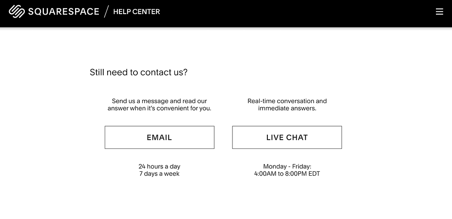
When those online resources fail to solve your problems–or when you just want an answer to your question without having to browse through hundreds of articles–the Squarespace customer support team also offers direct support lines for chatting with real people.
Although there’s no way to get someone on the phone, email support is available 24/7. In addition, you can have a real-time conversation with a support rep through the live chat module from Monday through Friday, 4 PM to 8 PM EDT.
Pros and cons of Squarespace
During our Squarespace review, we uncovered loads of advantages. But that doesn’t mean it’s perfect. Take a look below for a list of our Squarespace pros and cons.
Pros of Squarespace
Over 140 industry-leading templates with perfected designs and beautiful details like bold fonts, media-heavy schemes, and mobile-friendly layouts.
A true drag-and-drop builder where you can edit just about every element on the website. Squarespace also transfers over all demo content to the builder, while also providing drag-and-drop support for the header.
An impressive blogging platform compared to other DIY, SaaS platforms. It’s the closest thing you can get to WordPress in a DIY website builder.
A myriad of built-in features so you can focus on building your website with fewer apps and plugins. There are still nice integrations, but Squarespace minimizes third-party tools.
An incredibly simple interface with minimalist vibes, easy-to-find settings, and a view of your current website at all times.
Support for adding an online store, with advanced tools like abandoned carts, donations, and gift cards.
The pricing has become far more competitive with the evolution of Squarespace, especially when compared to the likes of Wix, Weebly, and Shopify.
Cons of Squarespace
The templates are wonderful, but they rely heavily on large images. You may find that swapping out the stock photos for your own don’t look as dazzling, especially if you aren’t using high-resolution photos.
There’s a 3% transaction fee for online payments in the Business plan, making that particular package far less appealing.
You have to save all changes when working in the drag-and-drop editor, as opposed to the automatic saving that comes with other page builders we’ve tested.
Squarespace lacks support for larger menus (like mega menus) making it less ideal for online stores and websites with hundreds of pages.
There’s no phone support.
Squarespace doesn’t offer as many third-party apps and integrations as other popular platforms.
Who should consider Squarespace as their website builder?
Even with a Squarespace review, making the final decision on a website builder is a little nerve-racking. After all, it’s the system you’ll use to manage your online presence in the foreseeable future; you should feel comfortable with the price, interface, and overall feature set.
Does Squarespace check all of your boxes? Here’s are some final thoughts on who we think should use Squarespace:
- We like Squarespace for visual-oriented businesses. We’re talking about those that plan on having sharp imagery on their websites: the photographers, artists, and fashion brands of the world, but also food, event, décor, and outdoor-focused businesses.
- It’s not a bad place to build an eCommerce store. The pricing plans are affordable (generally cheaper than Shopify and BigCommerce), and it supports unlimited products, abandoned cart recovery, advanced shipping, and several other essential eCommerce features. However, for heavy-duty eCommerce stores, you’ll still probably want a dedicated eCommerce solution like Shopify.
- Squarespace has also become more competitive with lower-cost solutions like Wix and Weebly. Wix and Squarespace are fairly similar in terms of value, and although Weebly has some cheaper plans than Squarespace, we’d argue that the best value–with features that all websites need–comes from Squarespace.
- We also think Squarespace serves as the ultimate solution for people who don’t know anything about coding. It’s almost silly how easy it is to make a professional-looking site without any experience.
- Go with Squarespace if you want to create a site with unique features like reservations, bookings, memberships, or portfolios. Squarespace has templates for all of these, along with content modules to implement the features within seconds.
If this Squarespace review has you convinced, then you can now follow our step-by-step Squarespace tutorial to make your site.
When to choose a Squarespace alternative
One thing we discovered in our Squarespace review was that if you want the most flexibility when it comes to adding features and integrating with third-party tools, you might want to go with a different platform.
If you’re willing to go with the self-hosted approach, WordPress is the absolute best option for flexibility. We have a tutorial on how to make a WordPress website and a WordPress vs Squarespace comparison.
If you’d prefer to stick with a SaaS website builder, Wix has a much larger app marketplace and more flexibility for adding code customizations. You can learn more in our Wix tutorial and Wix review.
Finally, if you’re specifically looking to launch a standalone eCommerce store, you might want to go with a dedicated eCommerce solution like Shopify or WooCommerce. While Squarespace’s eCommerce features are fine for simple stores, they don’t match the features and flexibility of a dedicated eCommerce platform.
If you have any questions about our Squarespace review, or if you’d like to give your own experience about your time with Squarespace, drop us a line in the comments section below.

Post a Comment