15 Call to Action Examples From Real Brands (And Why They Work)
Call to action (CTA) examples are all over the web, present in every bit of marketing material you read. They’re those simple, often-overlooked phrases that gently encourage you to make a move. When you only have seconds to make an impression on your audience, there’s a lot riding on your CTAs, so you’d be wise to consider them carefully.
By closely studying effective CTAs, you can learn what makes a strong one, while also ensuring that your copy doesn’t sound too generic. When you understand the key components of a winning tagline, you’ll know how to adapt them to your own offers.
In this article, we’re going to analyze unique call to action examples and discuss what makes them so effective. Let’s get to it!
Best call to action examples from real brands in 2022
For each example, we’ll put the brand and the CTA in the title. Then, we’ll share our thoughts on why it works well.
- Dropbox – Find the plan for you
- Trello – Sign up–it’s free!
- Adobe Photoshop – Find the right app
- Khan Academy – Learners, start here
- Twilio – Sign up and start building
- Sentry – Try Sentry for free
- BambooHR – Get my free demo
- Sherlock – Request 1:1 Demo
- Miro – Start a whiteboard
- Mailwarm – Reach Inbox
- Airbnb – I’m flexible
- Keap – Do work that matters. Automate the rest.
- Booking.com – Find your next stay
- Headspace – Get some Headspace
1. Dropbox – Find the plan for you
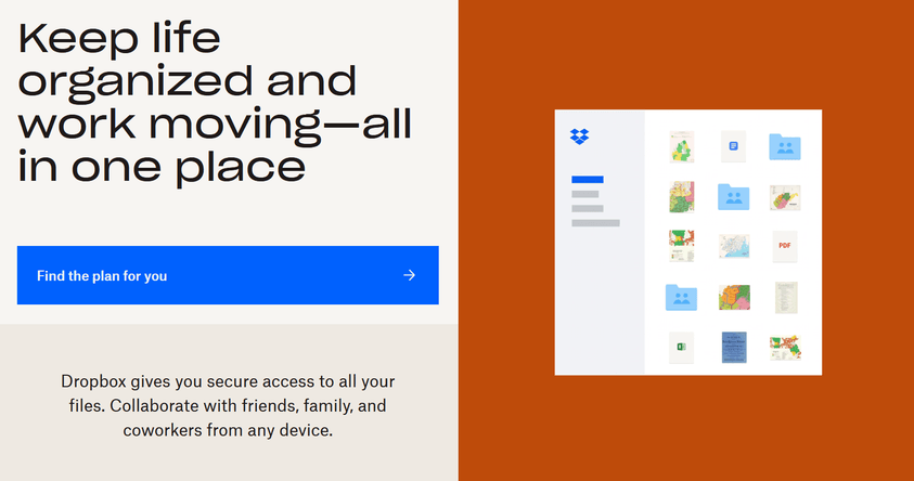
The goal of any CTA is to inspire visitors to take action. The clearer that action is, the bigger your chances are of convincing users. If you check out the Dropbox home page, you can see that it opts for a very clear-cut CTA reading “Find the plan for you”.
When you offer services that come in multiple tiers, it’s your job to guide users towards the choice that suits them best. The beauty of this CTA is that Dropbox actually does help visitors make the right choice. Once you click on it, Dropbox starts a quiz that it uses to determine which plan to recommend.
In this example, the key words are “Find” and “you”. Together, they indicate that users can make a personal but also assured choice since they will have help along the way.
2. Trello – Sign up–it’s free!
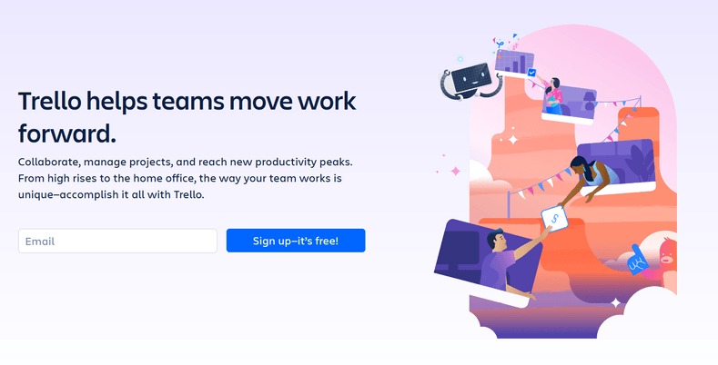
Sometimes, the most effective CTAs are the simplest ones. “Sign up” is one of the most common call to action examples you’ll see while navigating the web. There’s a reason it’s so popular, though – because it works.
“Sign up” encourages visitors to carry out an action they’re well familiar with. Trello takes this classic CTA and enhances it by adding a simple “it’s free!” When most visitors consider signing up for a service, the price will be a deciding factor. Therefore, by reassuring them that they can sign up at no cost, you eliminate that fear.
This CTA works for any website or service that offers a free plan. Once you convert visitors into users (even if they’re not paying for the service) it becomes much easier to convince them to upgrade to a paid tier.
3. Adobe Photoshop – Find the right app
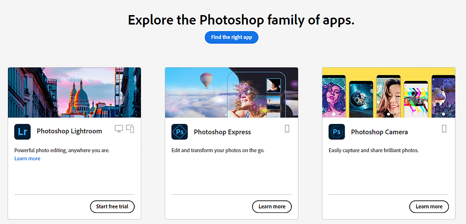
This CTA is very similar to the Dropbox example. Most users are familiar with the Adobe brand, so the challenge isn’t to convince them to try the brand out. Instead, it’s to help them find the right product for their needs.
Adobe follows its main CTA (“Find the right app”) with individual sections for some of its most popular software. Each section has its own CTA, including classics such as “Start free trial”.
Just as with Dropbox, Adobe launches visitors into a quiz once they click on the main CTA. The quiz is all about helping designers find the right tools for their needs. That way, they don’t end up paying for a subscription for the wrong service. This approach can help you gain your audience’s trust.
4. Khan Academy – Learners, start here

Khan Academy is one of the largest free online academies in the world. It offers art, math, and science courses across many levels. There are also a broad number of classes in additional subjects you can choose from. With so many options, it can be overwhelming for new users to take the leap.
“Learners, start here”, tells visitors they can begin their learning journeys with a single click. What’s more, the CTA identifies visitors as “learners”. This is much more personal and directed than “new users” or “guests”, and it tells them they’re welcome in the academy.
“Start here” is a classic call to action example, but when you combine it with this subtle personalization, it becomes much more effective. The brief messaging directly before the CTA also plays a big role in its success, as it empowers visitors by reinforcing that “you can learn anything” using the Khan Academy resources.
5. Twilio – Sign up and start building
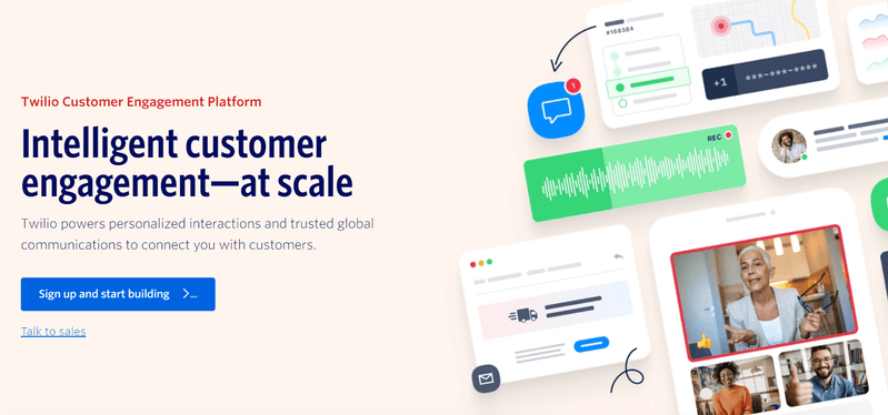
“Sign up and start building” is another take on a time-honored call to action example. You can see “Sign up” CTAs on almost every website that offers registration. However, few of those sites take the time to differentiate the action they want you to take.
With Twilio, you get access to a marketing platform that supports SMS, voice and video calls, and email. The prompt here is “start building” because you get to construct multi-platform campaigns from scratch.
If you pay attention, you’ll notice a second, smaller CTA below the main element. It says “Talk to sales”, which prompts visitors who are on the fence to connect with someone who can help them decide which plan to use or whether to sign up in the first place.
6. Sentry – Try Sentry for free
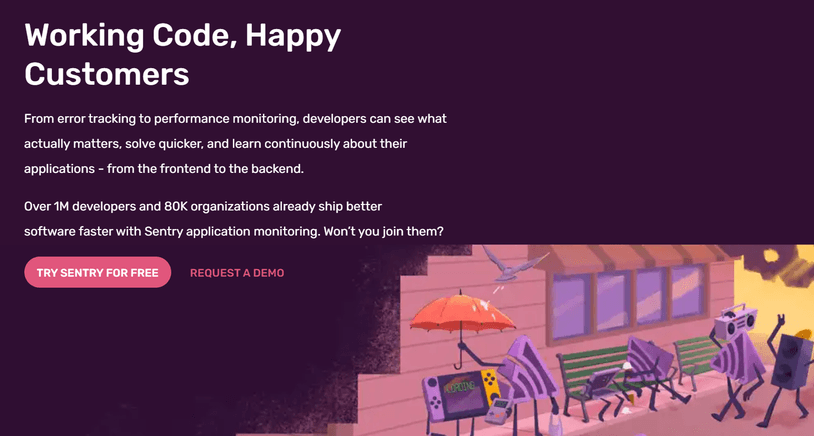
Sentry does an admirable job of providing a good overview of its platform offerings right from the get-go. By the time you get to the main CTA, you should already know whether you can benefit from using Sentry.
Since this type of service typically has high costs, Sentry offsets any concerns you might have by highlighting that you can try it for free. Moreover, it adds a small bit of customization by using the language “Try Sentry for free” instead of simply saying “Try it for free”.
The secondary CTA is designed to catch any visitors who might not be convinced to sign up yet. If you want to try the software, Sentry offers you the option of requesting a demo. This double-pronged CTA approach can help you maximize conversions.
7. BambooHR – Get my free demo

When you’re dealing with expensive B2B services that don’t advertise a price tag, convincing users to sign up becomes a lot more difficult. Usually, companies are hesitant to buy software as a service (SaaS) that doesn’t come well recommended or doesn’t offer a free trial.
BambooHR is precisely that kind of software. It offers custom prices depending on your needs, so it’s essential that the business is upfront about offering a free demo. “Get My Free Demo” is about as crystal clear as it gets.
This CTA also doubles as a lead-collection element. By offering a free demo in exchange for customer emails, users leave the door open for you to contact them down the road. That means you can write to users who haven’t accessed their private demo, or let customers know you’re available to answer any questions they might have.
8. Sherlock – Request 1:1 Demo
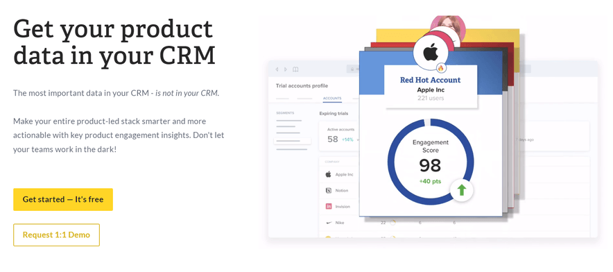
Sherlock does a fantastic job of outlining the benefits of using its product as soon as you land on its home page. It also hits you right out of the gate with two highly-compelling CTAs. The first one is a classic “Get started – It’s free”, similar to the Trello copy we looked at earlier.
The second CTA is much more unique. “Request 1:1 Demo” tells visitors that Sherlock is willing to offer private guided demos of its software. If you’re on the fence about a service, having someone walk you through exactly how it works, for free, can be a very compelling offer.
In this example, the “1:1” part of the CTA is what makes it stand out. Other companies use CTAs such as “Get my free demo” or “Sign up for a free demo”. Those can be effective too. However, the language here lets you know immediately that you’ll be getting a highly-personalized experience.
9. Miro – Start a whiteboard
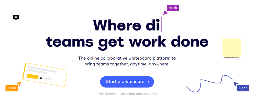
Online collaborative tools are more popular than ever these days. If you run a service that offers teams the potential to improve their workflows, you’ll need to differentiate your product from other platforms.
Miro does that by offering an experience that’s as close to a digital whiteboard as possible. Its CTA highlights that fact by prompting you to “Start a whiteboard”. In this case, the real hook is tucked right below the CTA. If you read that copy, it tells you that you can use the service for free, forever.
“Free” is a powerful marketing word on its own. When you tell users that you offer a service for free “forever”, you’re telling visitors they run zero risk by trying out the product or software.
10. Mailwarm – Reach Inbox
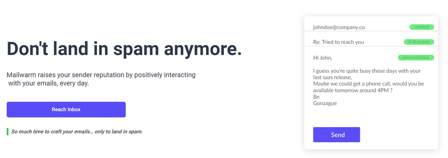
One great way to craft a powerful CTA is to use language that tells visitors precisely what they’ll be able to achieve if they click on the offer. That’s exactly what Mailwarm does here.
The service offers you help in increasing email deliverability rates. Naturally, its to-the-point CTA reads simply, “Reach Inbox”.
Users who try out this service know that getting their emails to show up in inboxes and not spam folders can make a huge difference for their business. By keeping the CTA brief, Mailwarm makes sure that visitors focus on the all-important end goal – reaching an inbox.
11. Airbnb – I’m flexible
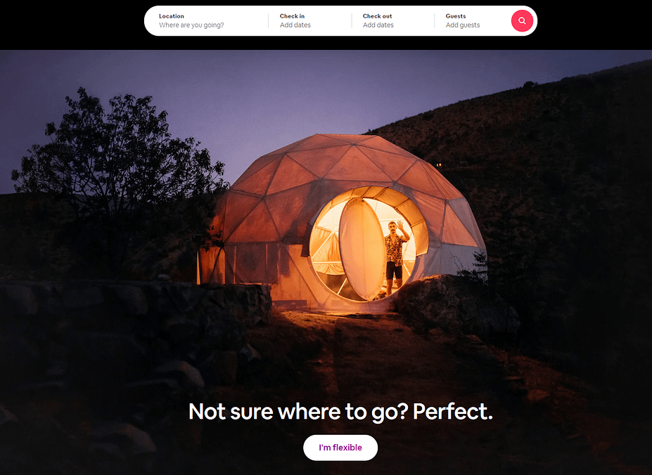
If you check out hotels or sites for booking private lodgings, you’ll find that most of them use tired CTAs such as “Book now” or “Make a reservation”. However, the Airbnb home page features one of our favorite call to action examples.
Airbnb has taken a traditional booking CTA to the next level. With the simple statement, “I’m flexible”, Airbnb can provoke a deep emotional reaction, igniting the wanderlust within every visitor.
When you see that call, you might imagine yourself in any location around the world. Since Airbnb can book houses or apartments in almost any corner of the globe, this messaging is perfect.
12. Keap – Do work that matters. Automate the rest.
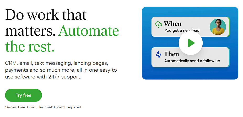
A common misconception about CTAs is that they need to come in the shape of buttons. In reality, an effective CTA can precede buttons or forms, acting as the hook instead.
That’s exactly the case with the Keap home page. The CTA here reads “Do work that matters. Automate the rest.” This compelling copy highlights the benefit of using the software. Namely, it enables you to automate repetitive tasks and free up time for more rewarding work.
One subtle design element to notice here is that Keap uses contrasting colors to make each part of the CTA stand out. This visual binary allows readers to imagine a world apart, where they can focus on the work that matters and forget about the rest.
13. Booking.com – Find your next stay

Booking.com may not be as hip as Airbnb, but it remains the biggest player when it comes to booking lodgings online. Its home page is all about functionality, and its primary CTA is incredibly compelling.
“Find your next stay” paints a clear message, right before Booking.com starts sharing its top listings. As soon as you see the message, you can start looking for available stays in properties all over the world.
The language prompts you to think about your next vacation and where it could be. Similar to Airbnb’s message, this can inspire excitement about your next trip.
14. Headspace – Get some Headspace
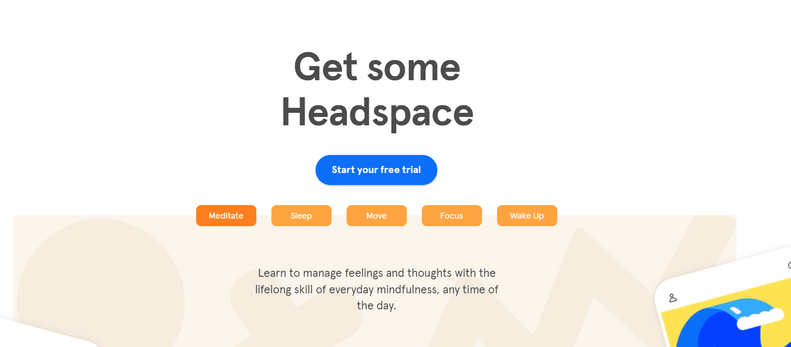
The Headspace home page showcases a multitude of call to action examples, ranging from the classic, such as “Start your free trial” to our favorite, which reads “Get some Headspace”.
We love this CTA because it ties directly into the brand. Plus, it’s wordplay. ‘Getting Headspace’ is both a call to action and a summary of what the app offers.
In this case, the language helps you associate the app with meditation and clearing your mind. Where most platforms and services push you to buy, Headspace manages to make its message about focusing on your own mental health.
Conclusion
Understanding what makes a compelling CTA will help you design landing pages and promote your products. Every website can benefit from CTAs, whether you’re looking for email subscribers, conversions, or more engagement on blog posts.
The common thread among great call to action examples is that they communicate a clear offer while also creating an emotional response. Just telling visitors to “Sign up” likely won’t be enough – you’ll be much more effective when you tap into users’ desires and fears. That way, you can inspire them to jump at your offers.


Post a Comment