If you run a blog or online business, you’ll want to make sure that your site aligns with the latest design standards. These include accessibility principles that apply to all websites. However, you may be wondering: what is universal design, and how can I use it on my WordPress site? ⚙️
Fortunately, universal design is a straightforward concept. Basically, it’s about creating websites that are accessible to users with different abilities and needs. Once you understand how it works, you can incorporate it into your site to create a more inclusive user experience.
In this post, we’ll take a closer look at universal design and its relation to web accessibility. Then, we’ll show you how to make your WordPress site more “universal”. Let’s get started! 👨🏫
What is universal design?
WordPress is a user-friendly platform that enables you to create a custom website without having to learn code. However, it’s important that every page on your site follows key design principles, such as universality. So, let’s start by answering the question, what is universal design?
👉 In web development, universal design is the practice of creating websites that are accessible and usable by all users, regardless of their physical and cognitive abilities. However, you could also say that universal design takes into consideration users from different geographical and cultural backgrounds.
In order to understand exactly what is universal design, let’s have a look at web accessibility. In theory, every website should provide equal access to its content. This means that even users with visual impairments or other disabilities should be able to interact with a site.
The Web Content Accessibility Guidelines (WCAG) were created to help web developers and site owners conform to these standards. WCAG also prioritizes inclusion in web design, addressing issues such as age, language, computer literacy, geographic location, and culture.
Therefore, universal design incorporates both accessibility and inclusion. This means users should be able to access and interact with the site (including anyone with disabilities) and understand the content (regardless of their linguistic background).
How to implement universal design in WordPress
Now that we know what is universal design, let’s look at how to implement it on your WordPress website.
- Use translation-ready themes
- Enable keyboard navigation
- Avoid difficult language and nuances
- Add alt text to images
- Use sufficient color contrast and clear fonts
1. Use translation-ready themes 🎨
As mentioned earlier, part of incorporating universal design is ensuring that users can understand the content, even if they speak a different language. Of course, this doesn’t mean that you must manually translate your site into multiple languages.
Creating a multilingual WordPress site is quite easy. However, before you get started, you’ll want to make sure that you’re using a translation-ready theme.
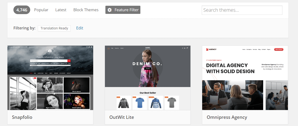
There are plenty of free themes that offer this feature. If you’re browsing the WordPress Theme Directory, you can click on the Feature Filter button and select Translation Ready:

It’s important to note that choosing a translation-ready theme will not automatically make your site available in other languages. However, the theme will be coded in such a way that it enables its various elements (like buttons and headings) to be translated.
You might also want to select RTL Language Support as a feature filter. This will enable you to translate your theme into a right-to-left language like Arabic, Hebrew, and Persian.
💡 If you’re in need of a such a theme, check out Neve. It’s one of the most popular themes in the directory overall.
Once you’ve chosen a translation-ready theme, you can easily translate your site using a plugin like TranslatePress. This tool integrates with Google Translate, so can set up automatic translation using your Google API key.
2. Enable keyboard navigation ⌨️
An important aspect of universal design is to cater to users with physical disabilities. For example, users with neurological disorders may be unable to use a mouse. Therefore, you’ll want to make sure that they can simply navigate through your website with a keyboard.
There are several accessibility tools that offer this feature, including Web Accessibility By accessiBe.
This plugin uses an AI-powered application to enable keyboard navigation on your site. This AI program will analyze the structure of your site and add keyboard functionality to all relevant elements, such as buttons, forms, and menus.
3. Avoid difficult language and nuances 😓
Universal design can also apply to the type of language used on the site. If you cater to a global audience, a large portion of your visitors will not be familiar with region-specific idioms or nuances. Therefore, you may want to stick with “universal” English.
Plus, many of your customers will have an intermediate level of English, so you’ll want to use clear and concise language. Even if a user speaks English as a first language, they may be unfamiliar with certain Americanisms or British expressions.
Additionally, your customers will come from diverse backgrounds. For example, if you have a law site, users with a higher level of education may already be familiar with some legal jargon. However, some will need an explanation of these concepts.
It’s also important that all text in key elements of your site, such as menus and call-to-action buttons, is written in clear language. This will make your content even more accessible, enabling users to understand the structure of your site.
4. Add alt text to images 🖼️
Alt text (short for alternative text) is typically a sentence that describes an image on a page. While this helps search engines better understand the contents of that page, it also makes your images accessible to users with visual impairments. This is because alt text is read aloud by screen readers.
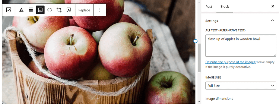
Ideally, you should add alt text to every image on your website. The process is very easy. In fact, you can add it straight from the Block Editor.
Simply select the image, then navigate to the block settings and write the description in the Alt Text field:

You could also add alt text to images from the Media Library. When writing this text, it’s important to be descriptive and clearly explain what’s in the image.
5. Use sufficient color contrast and clear fonts 🌈
Another way to make your site more universal is to use the right colors on your site. Users with visual impairments may find it a bit challenging to read text on a web page, particularly if there isn’t sufficient color contrast between background and foreground elements.
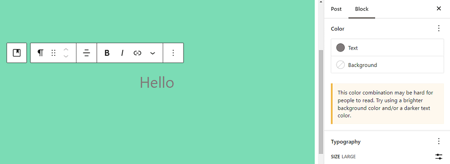
If you’re designing a page or post in the Block Editor, you’ll see a warning if your color combination makes the content hard to read:

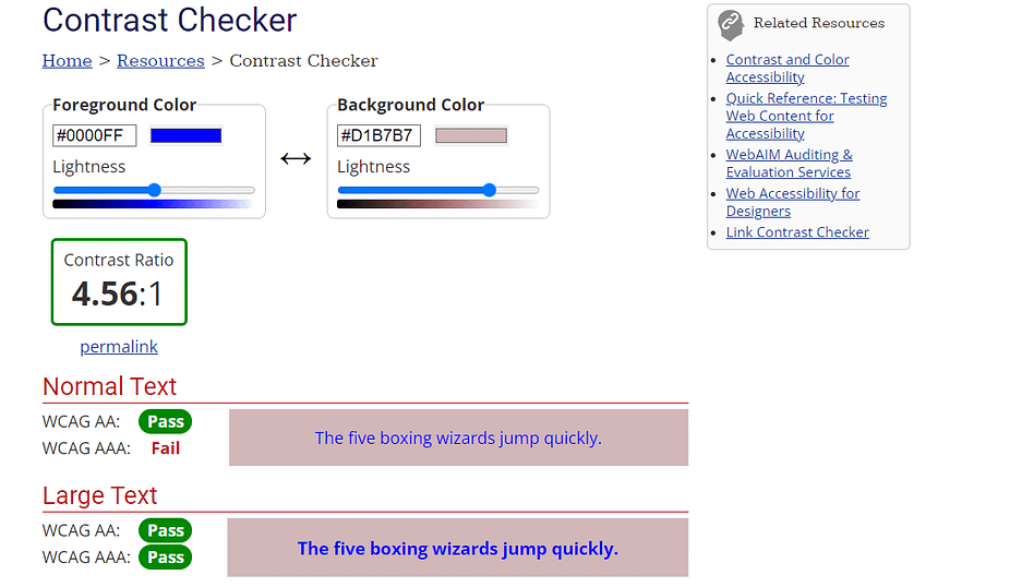
Ideally, you’ll want to use a light background and dark text (or vice versa). You can also use the WebAIM Contrast Checker to test your colors:

This tool shows you the contrast ratio between your chosen colors. It will also tell if they meet the WCAG accessibility guidelines. WCAG suggests a minimum contrast ratio of 4.5:1 for normal text, and 3:1 for large text to ensure optimal legibility.
Conclusion 🧐
Hopefully after reading this, you now have an answer to the question “what is universal design?”. To give you a quick recap, universal design enables users to access and interact with a website, regardless of their physical and cognitive abilities or their cultural backgrounds. It incorporates elements of accessibility and inclusion, which are outlined by the WCAG.
👉 Here’s how to make your site more universal:
- Use translation-ready themes. 🎨
- Enable keyboard navigation. ⌨️
- Avoid difficult language and nuances. 😓
- Add alt text to images. 🖼️
- Use sufficient color contrast. 🌈
.png)


Post a Comment